Area: Cognitive biases and heuristics · Evidence: strong (How we rate the evidence). Underweighting of base rates is highly reproducible in probability problems, though how far it reaches into everyday judgment is debated and presentation format changes it a lot.
In brief
A base rate is how common something is in the first place: how many people have a disease, how many travelers are smugglers, how many deaths come from a given cause. Base-rate neglect is the tendency to judge a case by how vivid or representative it looks while ignoring how rare or common that kind of case is. Messages that present a striking example or a raw count with no denominator invite exactly this error.
What the research shows
Kahneman and Tversky's 1973 paper on prediction gave the classic demonstration [1]. Participants read short personality sketches said to be drawn at random from a group of engineers and lawyers. Some were told the group was 70 percent engineers, others that it was 30 percent engineers. Their judgments of whether a given sketch described an engineer barely changed with that information. They judged by how much the description resembled a stereotypical engineer, a shortcut the authors called representativeness, and largely ignored the proportions they had been given. When a sketch contained no useful information at all, people tended to answer fifty-fifty rather than fall back on the stated rate.

Daniel Kahneman, photographed on 27 January 2009 by Eirik Solheim (NRKbeta). Source: Wikimedia Commons. CC BY-SA 2.0.
.jpg)
Maya Bar-Hillel's experiments used variants of problems such as the well-known taxicab problem, in which a witness identifies a cab's color in a city where most cabs are the other color [2]. She showed that people used base rates when they seemed relevant, especially when they were specific to the case being judged, and ignored them when they seemed like general background statistics.
The error also appears among experts. Casscells, Schoenberger and Graboys asked physicians and medical students at Harvard teaching hospitals a simple question: if a disease affects 1 in 1,000 people and a test has a 5 percent false-positive rate, what is the chance that a person who tests positive actually has the disease [3]? The correct answer is about 2 percent, because false positives from the 999 healthy people vastly outnumber the one true case. Only a small minority gave that answer. The most common answer was 95 percent.
Gigerenzer and Hoffrage then showed that the format of the numbers matters [4]. When the same information was given as natural frequencies ("of 1,000 people, 1 has the disease; of the 999 without it, about 50 test positive"), far more participants reasoned correctly than when it was given as percentages and conditional probabilities. This suggests part of the problem lies in how statistics are presented, not only in how people think.

The physicians' question restated in natural frequencies: of 1,000 people, 1 has the disease and about 50 healthy people also test positive, so a positive result is a true case about 1 time in 51. Drawn by FRAME from Casscells and others (1978) [3] and Gigerenzer and Hoffrage (1995) [4]. CC BY 4.0.
Has it held up?
The core effect replicates readily in classroom and laboratory problems, and the finding that doctors misread screening results has been repeated many times. The main debates concern its scope. Jonathan Koehler's critical review argued that the literature overstated the case [5]. Base rates are often used, just not as fully as Bayes' theorem (the formula for combining a prior rate with new evidence) prescribes. Many experimental base rates are arbitrary numbers people have little reason to trust, and in real life the "correct" base rate is often unclear. His conclusion was that people underweight base rates in some conditions, not that they ignore them everywhere.
The frequency-format effect has also been tested extensively. A meta-analysis by McDowell and Jacobs found that natural frequencies reliably improve Bayesian reasoning, but that even with frequencies most participants in most studies still did not reach the correct answer [6]. So presentation helps a great deal without making the problem disappear.
How it shows up in political messaging
- Nazi Germany, 1920s to 1945. Julius Streicher's weekly Der Stürmer filled its pages with individual stories of alleged crimes by Jews, presenting each case as typical of Jews as a whole [7]. The technique turns a small number of cases, many of them invented, into a picture of a whole population, with no reference to how often such crimes occurred among anyone else.
- US presidential campaign, 1988. The Bush campaign's "Revolving Door" ad attacked Michael Dukakis's record on Massachusetts prison furloughs. Its on-screen claim that 268 prisoners had escaped was presented against footage suggesting dangerous convicts walking free, without saying over how many furloughs or years that figure arose, or that most of those escapees were not first-degree murderers [8]. The ad used a raw count where a rate was needed.
- Gun-violence advocacy, 2018. After the Parkland shooting, a gun-control group's figure of 18 "school shootings" in the first weeks of 2018 was widely repeated. A Washington Post analysis found that the count included incidents such as a suicide in the parking lot of a school that had been closed for months, so the vivid category the number called to mind was far rarer than the total implied [9].
- Terrorism risk after 2001. After the September 11 attacks, many Americans avoided flying and drove instead. Gigerenzer estimated that the resulting increase in road travel led to roughly 350 additional traffic deaths in the three months after the attacks, more than the number of passengers killed on the four hijacked planes [10]. His later twelve-month estimate was about 1,500 additional deaths [11]. Government threat signals such as the color-coded Homeland Security Advisory System threat-level chart conveyed alarm without any stated base rate or scope.
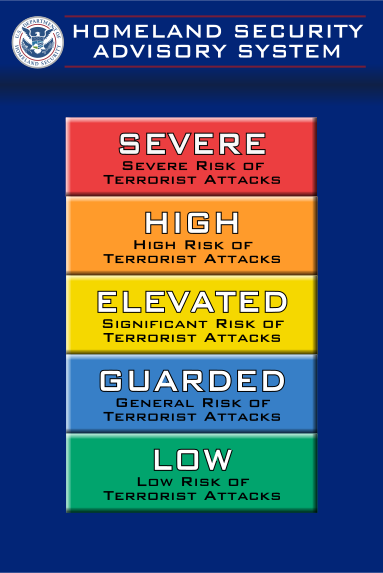
Homeland Security Advisory System five-color threat-level scale, U.S. Department of Homeland Security, in use 2002 to 2011. From the FRAME gallery: Homeland Security Advisory System threat-level chart
How to spot it
- A raw count ("268 escaped", "dozens of cases") appears with no denominator: out of how many, over what period, compared with what.
- A single vivid case is used to characterize a whole group, program or policy.
- A test, screening or profiling scheme is praised for its accuracy without any mention of how rare the target is, and so how many false alarms it will produce.
- Risks are compared by how frightening they feel rather than by deaths or harms per person or per year.
Persuasion or manipulation?
A single story can be honest and powerful when it illustrates a pattern the numbers support, and the writer says so. Honest writing gives the denominator, the time frame and a comparison group, and uses frequencies ("about 2 in 100") that readers can follow. It becomes manipulation when a case or a count is chosen precisely because it misleads about how common something is, when the base rate is known to the writer and left out, or when a rare event is used to justify blaming an entire group.
Archive techniques that lean on this
- Card stacking — Card stacking: its tell, a missing denominator, is the signature of base-rate neglect.
- Fear appeal — Fear appeal: stages a rare harm as imminent without the base rate that would put it in proportion.
- Scapegoating — Scapegoating: treats individual crimes by members of a group as typical of the group.
Related topics
- Availability heuristic — Availability heuristic
- Identifiable victim effect — Identifiable victim effect
- Negativity bias — Negativity bias
- Anchoring — Anchoring
- Fear messaging — Fear messaging
Sources
- Kahneman, D., & Tversky, A. (1973). On the psychology of prediction. Psychological Review, 80(4), 237–251.
- Bar-Hillel, M. (1980). The base-rate fallacy in probability judgments. Acta Psychologica, 44(3), 211–233.
- Casscells, W., Schoenberger, A., & Graboys, T. B. (1978). Interpretation by physicians of clinical laboratory results. New England Journal of Medicine, 299(18), 999–1001.
- Gigerenzer, G., & Hoffrage, U. (1995). How to improve Bayesian reasoning without instruction: Frequency formats. Psychological Review, 102(4), 684–704.
- Koehler, J. J. (1996). The base rate fallacy reconsidered: Descriptive, normative, and methodological challenges. Behavioral and Brain Sciences, 19(1), 1–17.
- McDowell, M., & Jacobs, P. (2017). Meta-analysis of the effect of natural frequencies on Bayesian reasoning. Psychological Bulletin, 143(12), 1273–1312.
- United States Holocaust Memorial Museum. "Julius Streicher." Holocaust Encyclopedia. https://encyclopedia.ushmm.org/content/en/article/julius-streicher
- Jamieson, K. H. (1992). Dirty Politics: Deception, Distraction, and Democracy. Oxford University Press.
- Cox, J. W., & Rich, S. (2018, February 15). No, there haven't been 18 school shootings in 2018. That number is flat wrong. The Washington Post.
- Gigerenzer, G. (2004). Dread risk, September 11, and fatal traffic accidents. Psychological Science, 15(4), 286–287.
- Gigerenzer, G. (2006). Out of the frying pan into the fire: Behavioral reactions to terrorist attacks. Risk Analysis, 26(2), 347–351. https://doi.org/10.1111/j.1539-6924.2006.00753.x
Images
| Image | Source | Licence |
|---|---|---|
| Daniel Kahneman (2009) | Wikimedia Commons, photograph by Eirik Solheim (NRKbeta) | CC BY-SA 2.0 |
| Dot diagram: 1,000 people tested (Casscells and others 1978; Gigerenzer and Hoffrage 1995) | Drawn by FRAME from sources 3 and 4 (make_cognitive_bias_diagrams.py) |
CC BY 4.0, FRAME |
| Homeland Security Advisory System scale (2002) | FRAME gallery, Homeland Security Advisory System threat-level chart | Public domain (U.S. government work) |
Image gaps
Front pages of Der Stürmer (the page's first case) and the 1988 "Revolving Door" advertisement were not verified as public domain or openly licensed for hosting, so they are cited, not hosted.